Company
About
Oro D’Venezia is an Italian jewelry brand known for its timeless craftsmanship and attention to detail. When it came to their packaging, they needed more than just a box—they wanted an extension of their brand’s elegance and exclusivity.
Client
Oro D’Venezia
Sector
Jewelry
Location
Italy
Services
Branding Manual for Packaging;
Packaging Design Guidelines;
Material, Color & Typography Curation.


Goal
The goal was to elevate their packaging, ensuring that every jewelry box reflected the luxury and prestige of the pieces inside. Oro D’Venezia wanted a refined, cohesive brand identity applied to their packaging, creating a seamless unboxing experience that resonated with their high-end clientele.
Our Strategy
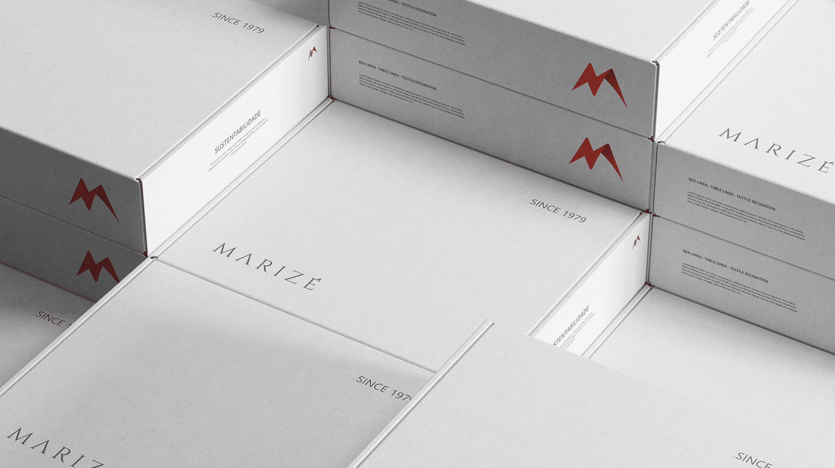
To bring this vision to life, we developed a custom Branding Manual focused on packaging design. This guide served as the foundation for crafting elegant and sophisticated jewelry boxes that aligned perfectly with the Oro D’Venezia brand.
Refined their visual identity, ensuring consistency across materials, colors, and finishes.
Designed premium packaging elements, balancing aesthetics with functionality.
Curated color palettes, typography, and branding elements, ensuring the packaging felt as luxurious as the jewelry itself.
Every design decision was made with the brand’s high-end positioning in mind, ensuring that Oro D’Venezia’s customers experienced luxury at first touch.

Project
Process
We developed a comprehensive and detailed Branding Manual, specifically tailored to guide the packaging design process. This manual provided clear, structured guidelines on every aspect of the packaging, ensuring that it perfectly aligned with the brand's identity and elevated the overall customer experience.
One of the key components of the manual was the material selection, which was carefully chosen to enhance the tactile experience.
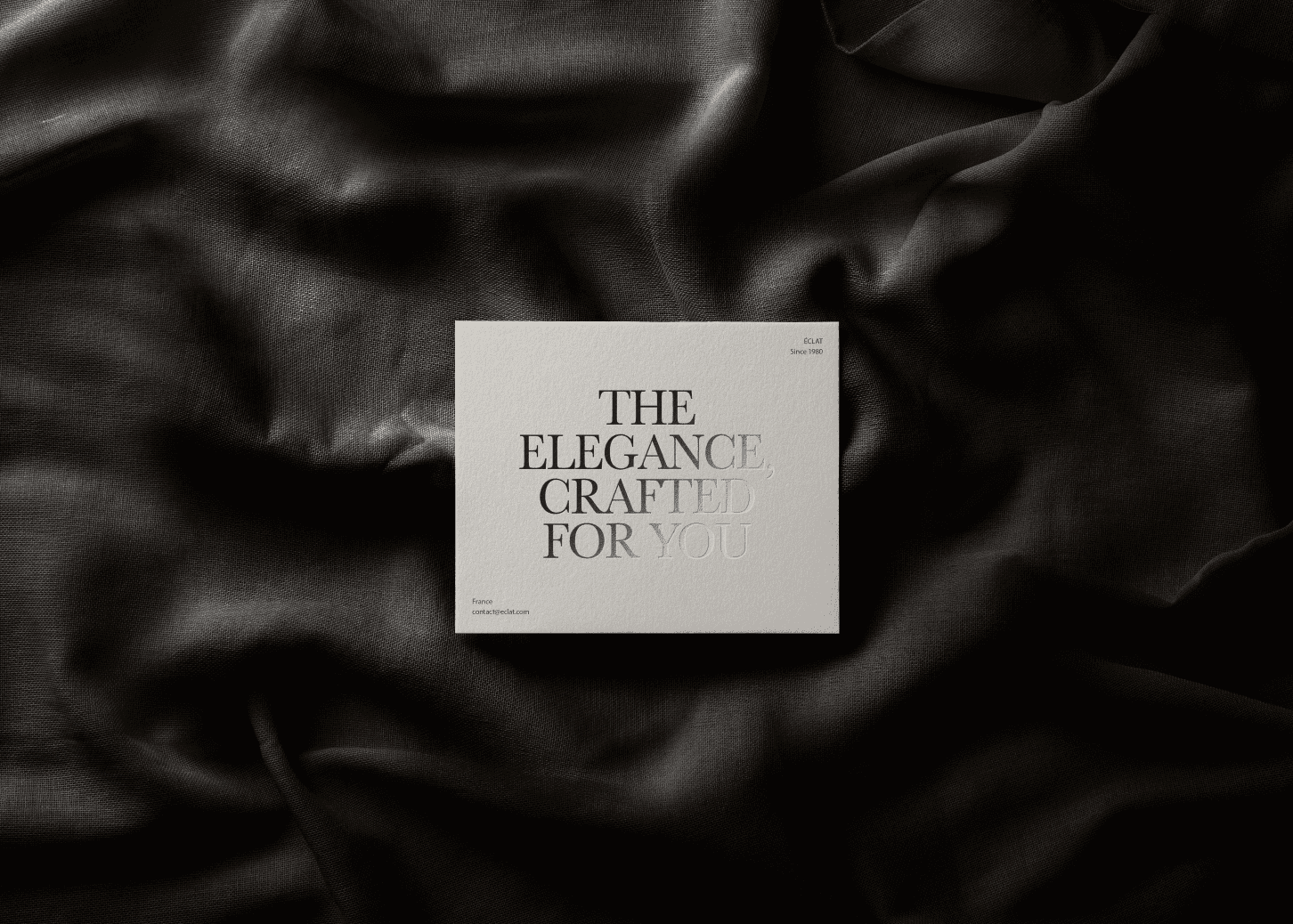
The right materials were selected to convey a sense of quality and luxury, making every interaction with the packaging feel special and intentional. The manual also included precise guidelines on color and finish choices, ensuring that every packaging element exuded luxury and sophistication.
We carefully selected colors and finishes that not only represented the brand’s high-end positioning but also created a visually appealing and cohesive aesthetic. Additionally, the manual addressed typography and logo placement, ensuring that both elements were positioned in a way that was refined and balanced.
Every detail, from the size of the text to the placement of the logo, was meticulously crafted to create a harmonious and sophisticated look, reinforcing the brand's image and ensuring consistency across all packaging.
By carefully curating these guidelines, we ensured that the packaging not only reflected the brand’s identity but also provided an elevated, luxurious experience for customers from the moment they interact with it.

Oro D’Venezia now has a sophisticated, high-end packaging solution that enhances their jewelry’s perceived value and reinforces their brand identity. A simple box became an integral part of the luxury experience, ensuring that from the moment a customer receives their piece, they feel the craftsmanship and exclusivity that define Oro D’Venezia.